Christopher Cancelliere
Neighborhood Bike Shop
Website Design & Development

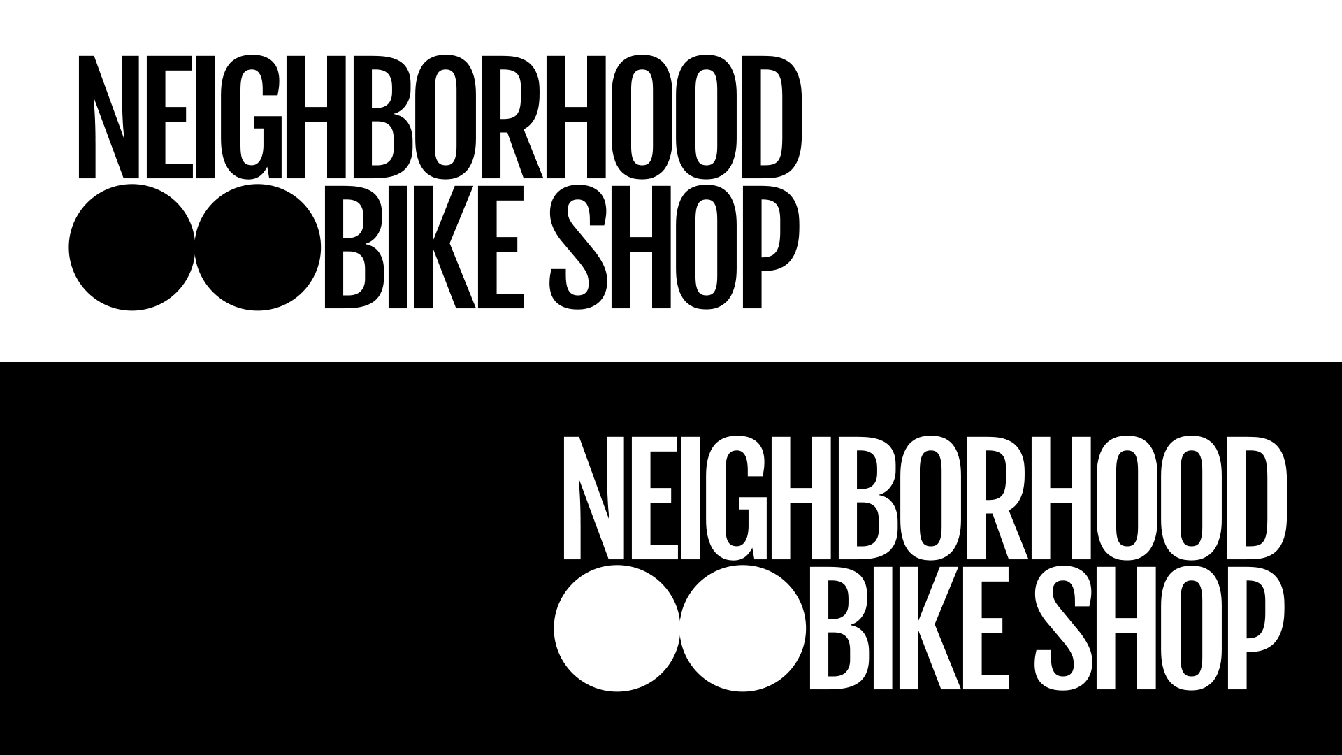
Logos
Simple, Bold, and Easy to Read. If I'm using text like this, I like to create high-contrast, heavy logos because they stick with the mind a little bit longer and don't leave too much for the imagination.
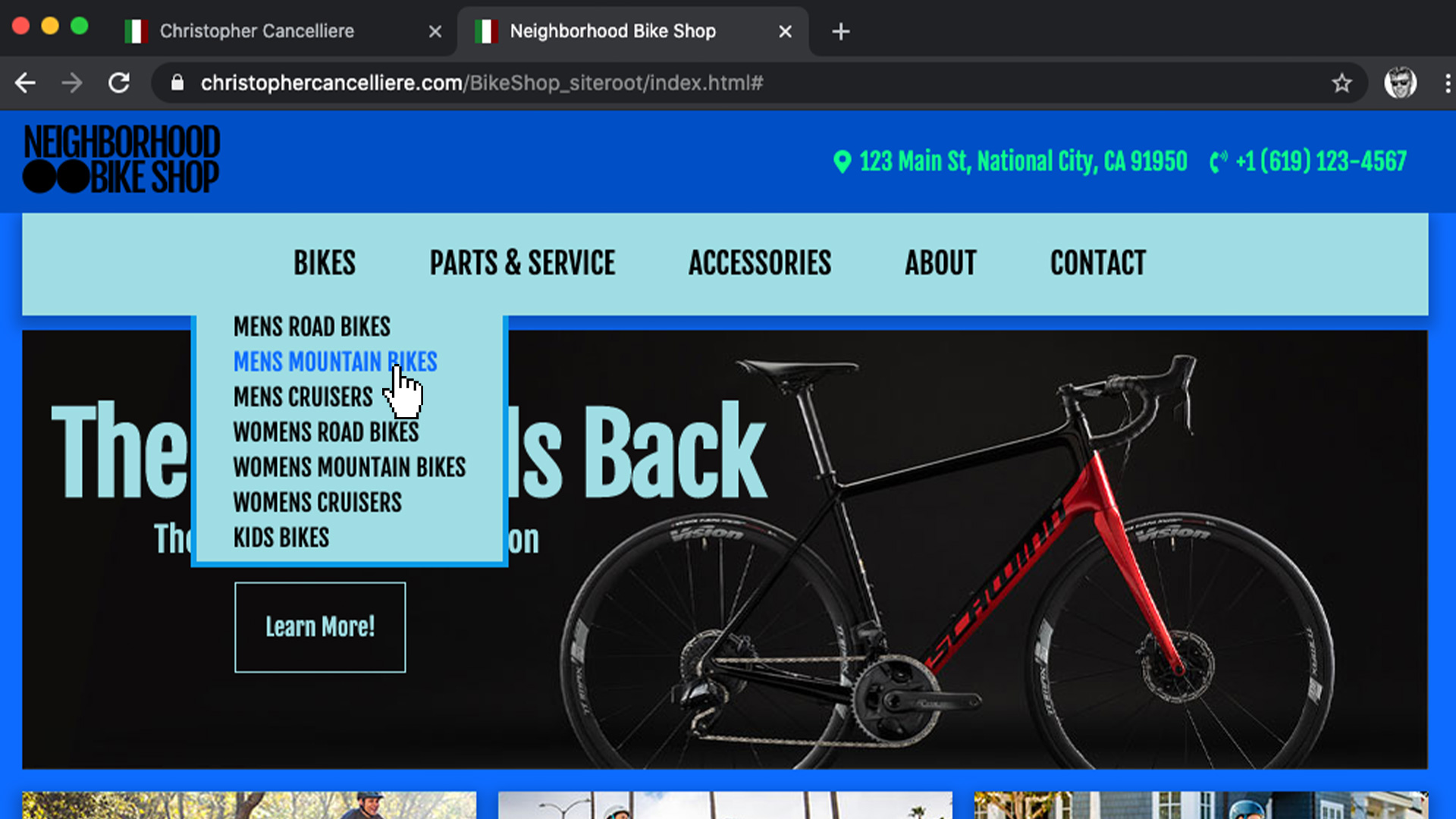
Drop Down Menus
The standard way to display navigation when it doesn't all fit. You can do it with a hover, a click, a button, or even with the clapper.
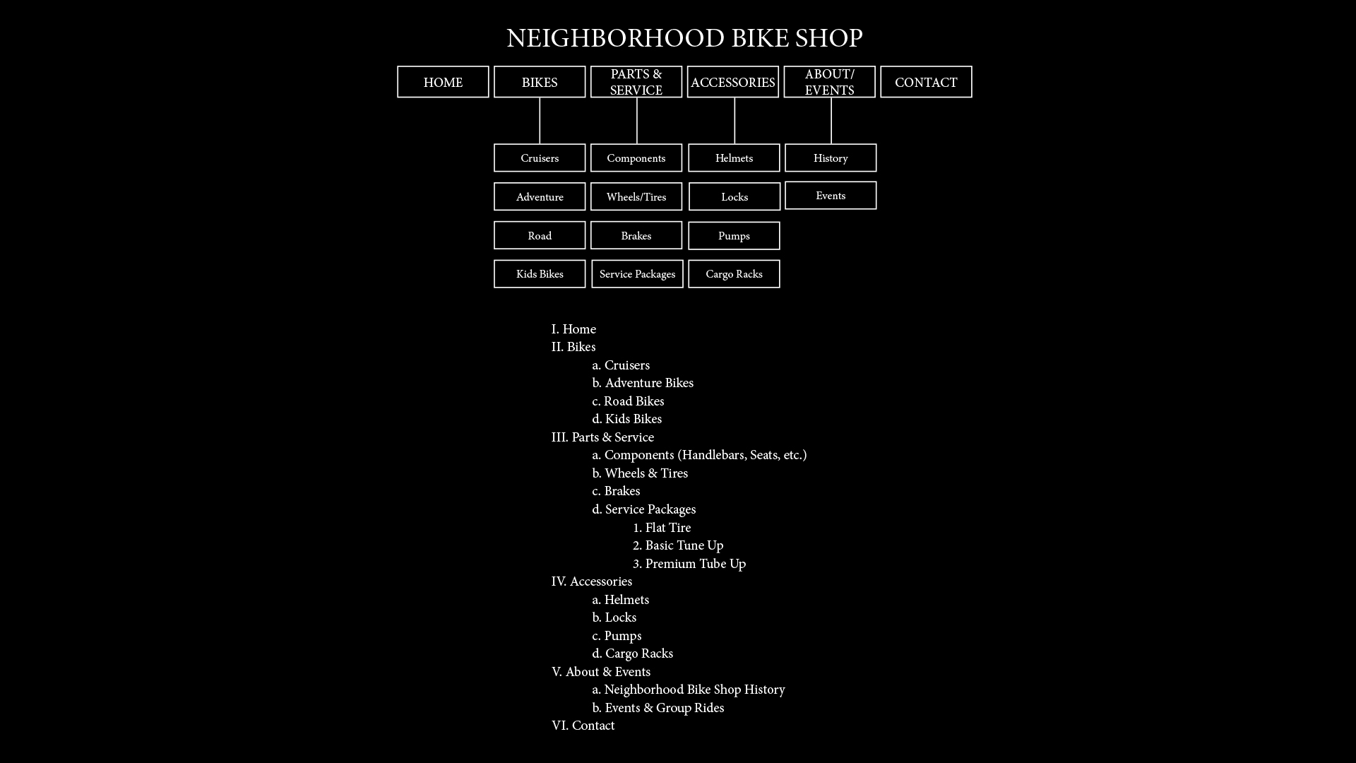
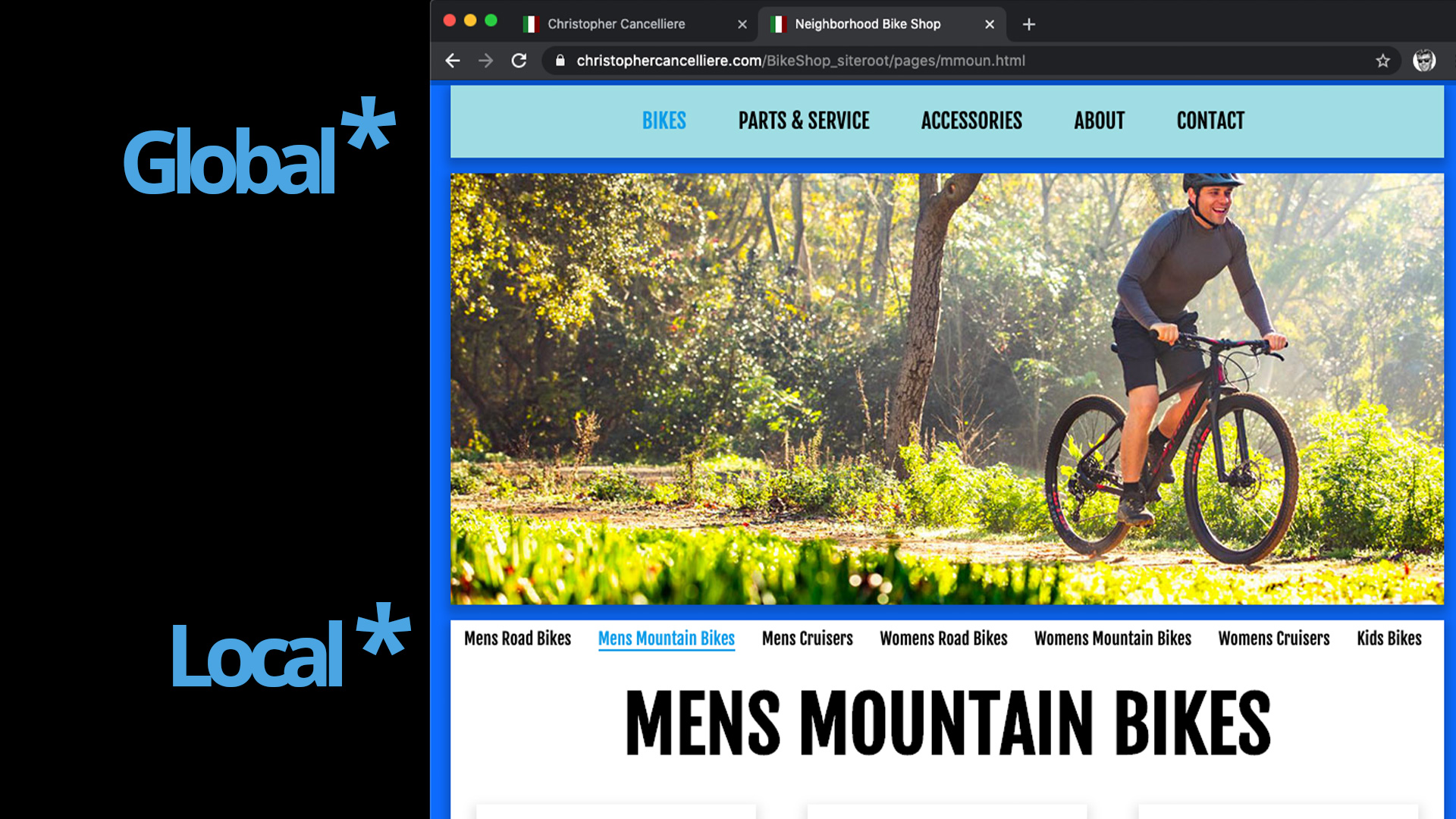
Global and Local Navigation
The incorporation of local navigation is a great way to make it easier to get around the guts of your site. Less clicking around looking means more sticking around buying.
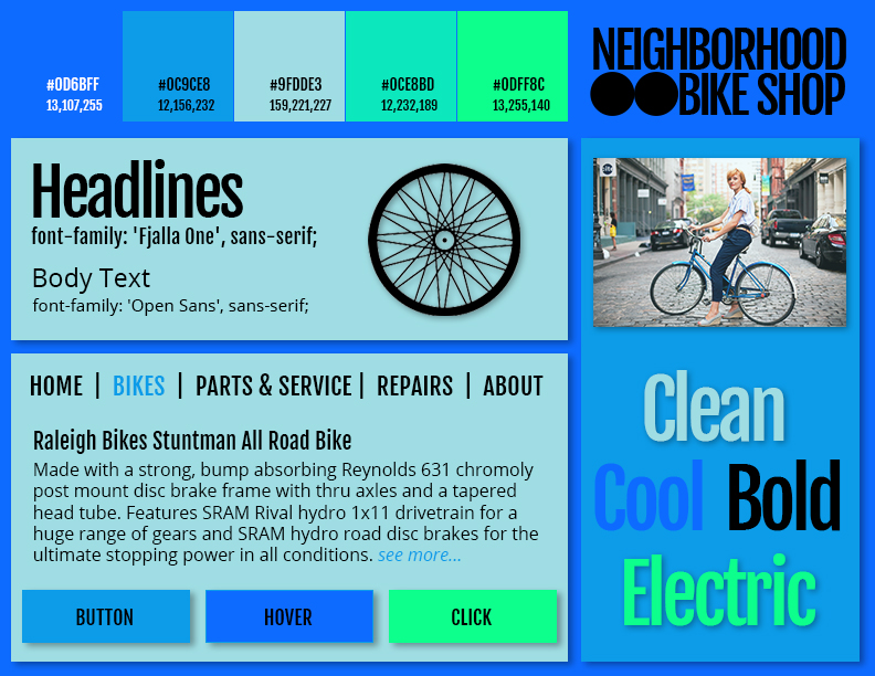
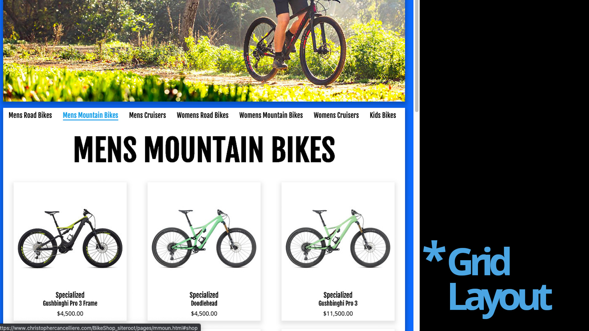
The Grid Layout
Not only is it a good way to display products so your customers can see them, but it makes it really easy to add, remove, and change them as well. As the inventory grows and shrinks, so can the site.
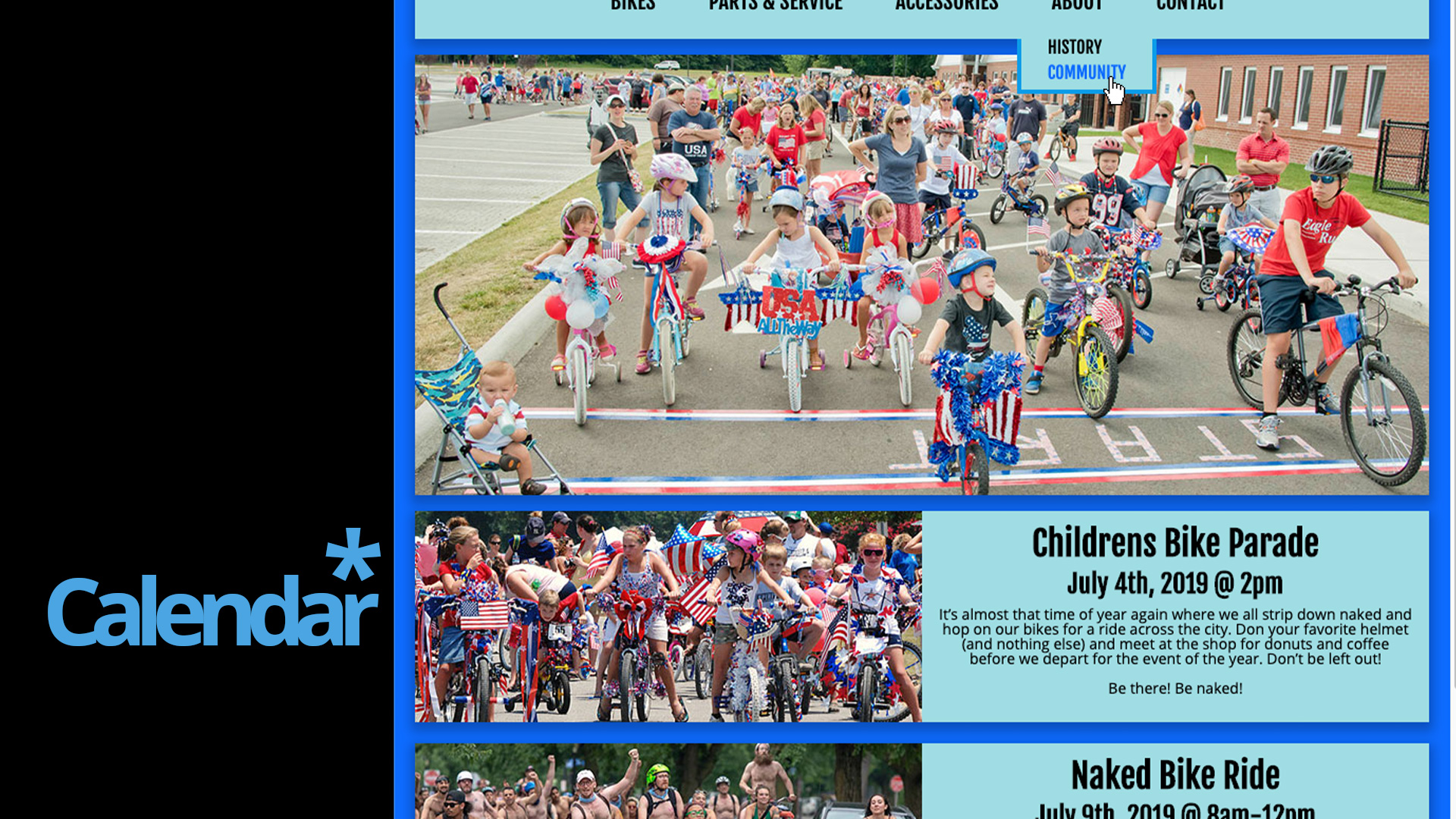
Calendar, Blog, Event List.
Add these things to your site to keep your customers informed and to keep your content churning!
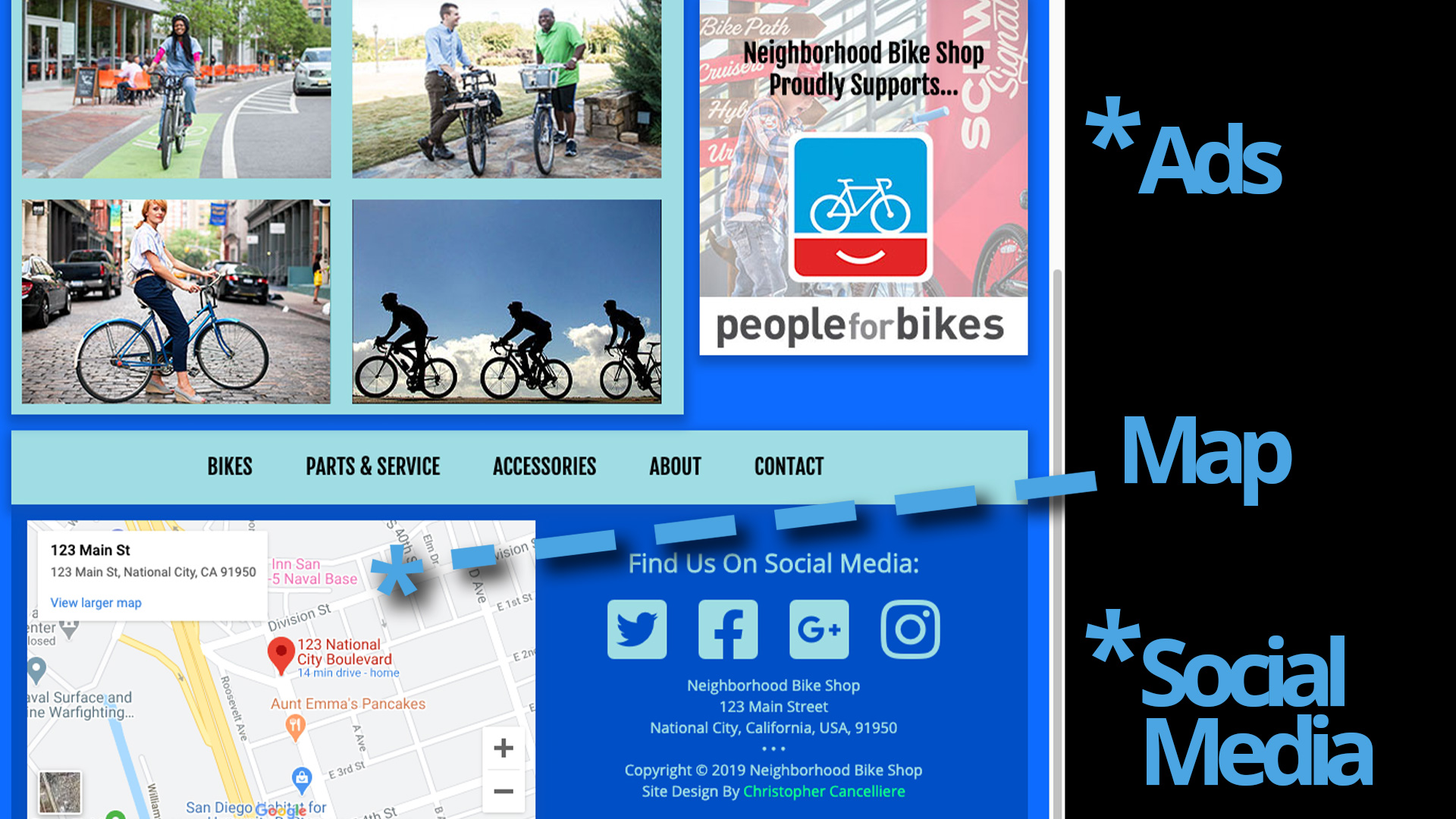
Advertising, Maps, Social Media Links
Ads not only generate income, but they can sometimes also convey a level of legitimacy to your site. Social media is a must in (INSERT YEAR AFTER 2008) so put it there. Maps are a great way to show your physical location to potential visitors (They're also a great way to discover the pancake shop right down the street)